When you design a website the ultimate goal is CONVERSION. Conversion Rate Optimization or CRO is a common practice followed by successful marketers to convert visitors into customers.
Opposed to the common misconception that online marketing is very costly and only affordable by big entrepreneurs, CRO boost conversion rates without incurring large and impractical expenses.
Let us point out some barriers to CRO, how it can adversely affect the “selling potential” of your website and subtle ways in which it can be overcome:
1- Speed means Customer Satisfaction
Slow sites are a bad User Experience (UX). Period.
Impatient Users get irritated by a slow loading webpage.
Back in 2009, Google conducted a research which shows that slowing down a page by 100-400 milliseconds (less than half a second) reduced searches by 0.2%-0.6%. This might sound like a small number but it amounts to a loss of 14,400 searches, per minute! Furthermore if the website keeps up this trend for a considerable time, the users get detached with an accelerated pace.
According to a study by Strangeloop networks a mere 1 second delay can cause “16% decrease in UX, 11% fewer page views and 7% loss in conversion”.
But it is 2016 and times have changed substantially. With plethora of options available to users, page loading time has become more important than ever. Here is a graph which compares bounce rate with loading time of the page.

Nowadays people expect a website to load within 3.7 seconds. Typical Ecommerce websites take 4.9 seconds to become usable.
If your homepage is loading within 3 seconds you are good to go, if it is about 6-7 seconds you are doing okay (but need to improve it) but if it is more than 10 seconds, your business is suffering significant loss .
Follow these suggestions to make your pages load faster:
- Minimise the number of java-driven apps. Remove the CSS and javascript of old unused apps from your page’s HTML. Also remove useless META tags.
- Compress and Optimize Images using online/offline tools especially on homepage, slideshow or hero section of your website.
- Above-the-fold information must load as quickly as possible. You can use lazy loading for everything else.
- Optimize dependencies like social media plugins, CMS and a single tracking script to analyse traffic.
- Use G-Zip encoding (just like compressing data in zip files).
- Make sure to host your website on fast web servers.
- Load background images using unconventional methods like external CSS. Try avoiding inline Javascript and CSS.
- Use specialized fast network servers called CDN (Content Delivery Network) for static components such as Javascripts, CSS and images.
- Optimize caching and minimise cookie size for enhanced loading speed on subsequent visit.
- Use Google PageSpeed Insights to analyze content of your website and generate suggestions.
- Use Google Analytics->Behaviour->Site Speed to measure real-world load times.
2- Complexity drive Customers away
DO NOT try to make all the services of your business needlessly stuffed on a single page. Your website needs to be as simple as possible. Check out some award winning websites employing minimalist design.
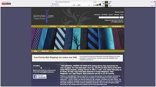
This case study by Gravitydept quantitatively explains impact of transformation of a website to a simpler interface.
BEFORE
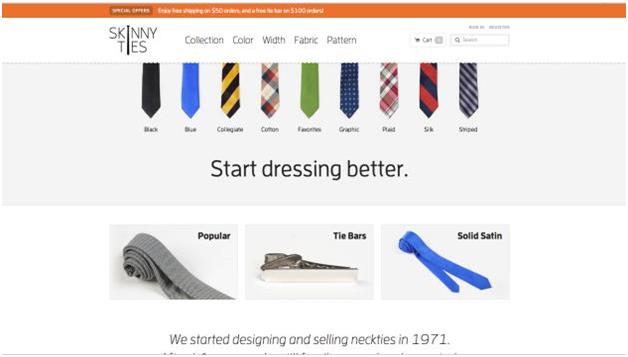
AFTER
Changes employed were subtle but profound:
- Monolithic Magneto upgrade- The entire codebase was transformed for a modern foundation.
- A responsive design- To adapt to different platforms, screen size and resolution.
- Performance- Uncached initial load page of 210 Kb(63% lower than previous page).
- Multifaceted navigation- Structured attributes for width, length, color, fabric and pattern.
- High quality images- A dedicated shoot for beautiful, ambient photos.
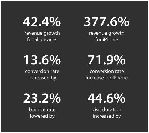
The revamped website was quietly launched to measure organic user’s interaction and the results were staggering:
Follow these instructions to make your website simple and effective:
- The home page of your website must only show the most important things like name, headline, succinct text, CTA(if important). Keep it extremely simple, the user knows what they should do next.
- Use predictive and intuitive features like drop down menu and easy editing. Customer must not struggle to find the basic elements like account info, cart and checkout.
- No ads on the home page! Website embedded with ads look very unprofessional. They may also ruin the look and feel of your website.
- Simplify sign-up and sign in process. User may bounce by the complications. Use social media sign up.
- In an ecommerce website make checkout as simple as possible to reduce the drop off. Use guest checkout option.
- Make user feel better psychologically by making the form appear smaller and simpler.
- Ensure that error messages do not contain technical language. A common user might not understand it.
- A/B testing after every significant change.
3- It is important to have a Single Focus
What is the use of being jack of all trades but master of none?
The Goal of the website must be clear and more importantly exclusive. It must serve a unique and a single purpose in user’s life. Different type of unrelated information on a single website makes it hard to understand and in plain words unbearable.
User gets distracted from the original goal and hence your conversion rate suffers.
The simple template above describes the concept of singularity neatly.
It aptly serves the purpose without any pain and suffering to user. Instead of cluttering the page with plethora of information, provide options when the user wants it.
Follow these instructions to maintain the focus of the website precise and clear:
- Clearly define the goals of your website.
- Fix your target audience and design accordingly. Use RWD (Responsive Web Design) to make your website usable for a large mobile user base.
- Do not give user other actionable options apart from the one single goal.
- Use single keyword across all your PPC (pay-per-click) ad and landing page.
- Use social media buttons carefully. Sometimes they are distracting. Do A/B testing to see if it increases CTR or the other way around.
- With the help of SKU’s, display the availability of products in stock to drive urgency factor.
- Multiple CTA (Call-To-Action) can create confusion and subsequently less conversion. In any case use only single CTA.
4- Dullness and Redundancy feels repulsive
First impression is the last impression.
Interesting information keeps flowing in from different mediums. A study has proven that due to wide usage of Internet human being now has an attention span of 8 seconds. Hence you need to grab user’s attention in a very short span of time.
If you fail to make an impact within the given time period, it will simply walk away from your product without a second thought.
What you need to do is:
Give your page a quirky headline– It is much more important than the content itself. To make a headline more appealing you can infuse it with the following features:
- Surprise- BEWARE! does the trick effectively.
- Question- “why does my website suck”- because you don’t have this title!
- Numbers- Check the title of this blog. Neat, isn’t it?
- Curiosity- Leave your readers hanging in midst of a statement like “i used to be afraid of programming but when i started”.
- Negatives- “Electronic waste is destroying the planet, click to know how”.
- Direct references- “HEY YOU! Have you designed the perfect website yet?”
After an interesting title, give relevant and interesting subheadings like below
How to make your page more interesting and user friendly:
- Ask from user’s point of view, what will this page serve to me?
- Add videos to your page to explain your product and service.
- Use Keywords, in Title, headings and subheadings. Keep keywords limited, simple and precise.
- Include different and latest payment options like PayPal, AndroidPay, ApplePay. Ensure easy toggle between them. You lose a customer if user’s preferred payment option is not listed.
- Prompt customers to login/create an account. Use social media login.
- When a field in form has been filled correctly, validate in real-time by visual means. Enable user to make changes right away.
- Your subheadings need to connect, intensify or increase curiosity.
- Use strong CTA copy with interesting text and visual appeal. It must sound friendly and not “pushy”.
- Write directly to your audience by using the word “you”.
5- Trust and Reliability forms the cornerstone for relations
Trust is a big deal, offline or online. It extends way beyond Ecommerce.
When you are dealing with an audience you haven’t even interacted with, your website will drive customer’s trust in your business.
It is known that users form opinions about your website in less than a second (50 ms)
As a golden rule- Remember!
Great design gets people to trust you, poor design creates mistrust and makes users bounce off.
So how can you build trust online? Follow these directions:
1. Show off– as shallow as it sounds, people will trust you if you LOOK GOOD. People judge the book by their cover and your website by its design.
2. Show availability– it doesn’t mean to stay online 24×7 or replying to every other email. Make your address and phone number visible and show your user that you can within reach.
3. Save customer’s preferred settings and make it default for him for subsequent use.
4. Be upfront about the benefits of doing business with you.
5. Allow customers to keep items in cart but checkout with other products. Ensure safeguard of products in cart.
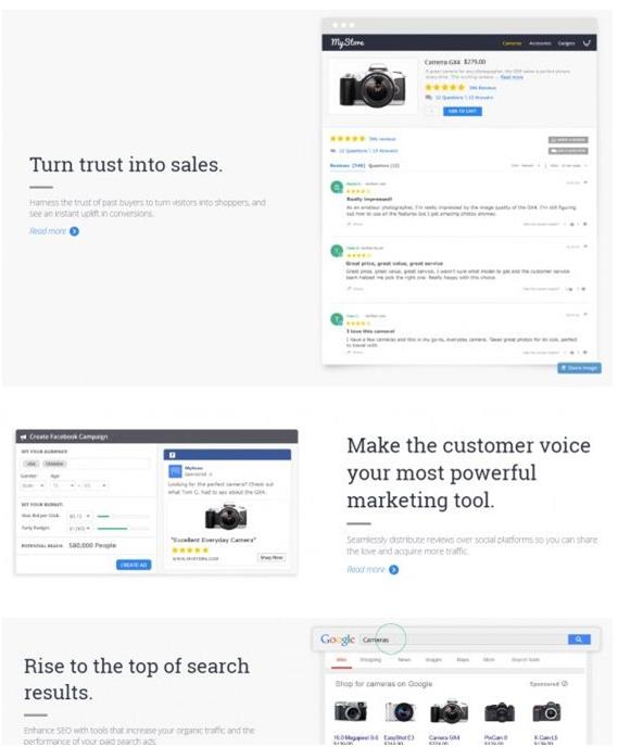
6. Build trust and credibility by using symbols and testimonials.
7. Get help from consumers– the best way to build trust is to get help from the people who already trust you. One very simple way is to ask for authentic user reviews and boost your ratings.
Innovate to Inspire curiosity
CRO is complex. It needs extreme hard work for results to substantiate.
The online community is potent. It pursues exciting innovation.
Apart from using the above strategies to boost Conversion Rates, you need to innovate and come up with a unique idea and you can conquer the Digital Domain with finesse.