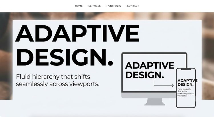
Responsive design, mobile readiness, and flat UI aesthetics have evolved from modern novelties into baseline web standards. However, creating a functional layout is no longer enough to keep visitors engaged—or to satisfy search engine algorithms.
Psychological research shows that users form an opinion about a website’s visual appeal in as little as 50 milliseconds (0.05 seconds), with 94% of initial impressions directly tied to design and layout. Furthermore, data from Google and Deloitte reveals that improving site responsiveness by just 0.1 seconds increases conversion rates by over 8%.
To capture attention within this narrow window, modern web architecture relies on specific technologies:
- Google Core Web Vitals: Standards measuring LCP (Largest Contentful Paint for loading), INP (Interaction to Next Paint for responsiveness), and CLS (Cumulative Layout Shift for visual stability).
- Next-Gen Media Engines: Leveraging lightweight AVIF/WebP image formats and vector graphics to deliver high-resolution visual storytelling without sacrificing performance.
- Hardware-Accelerated UI: Utilizing lightweight CSS transitions instead of heavy JavaScript threads to keep user interactions smooth and low-latency.
When executed together, these technical and visual patterns turn passive browsing into an engaging, high-performing digital experience.
Modern UI Patterns That Drive Engagement & Ranking
Strip Everything Except the Essential Components
Minimalist sites characterize one of the central standards of web design: simplicity. Stripping away everything except the essential components accomplishes more than just giving your site an air of elegance—it also reduces loading times, which is a major advantage for mobile browsing. Plus, fewer components mean an easier responsive design process. The recent trend of single-page sites simply follows this trend of moderation in style, making viewing easier and more entertaining than before. The one-page Scalia theme is a great choice for WordPress designers.
Micro-Interactions and Low-Latency Motion
Animation must balance visual flair with execution speed. Heavy JavaScript animations block the main browser thread, degrading your site’s INP (Interaction to Next Paint) score. Instead, modern sites utilize hardware-accelerated CSS micro-interactions. A subtle button state change or smooth drawer reveal gives instant feedback to the user, confirming actions succeeded while keeping page responsiveness under 200 milliseconds.
Influential Animations
Since animation naturally attracts attention, motion can influence the visual hierarchy of what gets seen first. In addition, animation also indicates relationships: imagine an animation of a window shrinking and flying into the menu—this movement confirms the action’s success and shows the user where on the menu they can find that window later. The design of Monster CSS depicts the best way to display influential animations on your site.
High-Definition Backgrounds
With more people owning high-definition devices, it was simply a matter of time before this pattern caught on. HD is any resolution greater than 200 ppi (dpi), while standard definition is 72 ppi. This makes images designed for standard definition seem blocky or blurry on HD devices, whereas HD images look crisp on SD displays. That means users with SD displays won’t notice a negative difference—but those with HD certainly will. The Aqua Reel theme is a wonderful example of an HD background.
Expressive Photography
This is most clear with the prevalence of hero images—single photographs that fill the entire background. Hero images draw users in much faster, making them ideal for landing and login pages. Expressive photography involves photos that convey a specific emotion or mood.
Dynamic Typography
With font legibility no longer a concern and the widespread availability of new, free fonts, typography has started playing a much larger role in web design. Dynamic typography doesn’t necessarily mean wild or elaborate fonts—in fact, the most common approach relies on simple typography, fitting right in with trends like flat design and minimalism. The trend of dynamic typography refers to any text that draws attention to itself, whether simple or elaborate. This includes typefaces that are extremely large or extremely small. The image by Pixelmash presents a beautiful pattern that can be achieved via dynamic typography.
It’s more important that you apply trends based upon the needs of your users rather than the desire to just be trendy. Not all of these trends will work for every site, so always work your way backward from the user.
Designing with Purpose
Trends should always serve user intent rather than visual gimmickry. Start with your audience’s core goals, pair them with lightweight performance standards, and build your interface from the user experience backward.
